Typography III
Museum stationery set
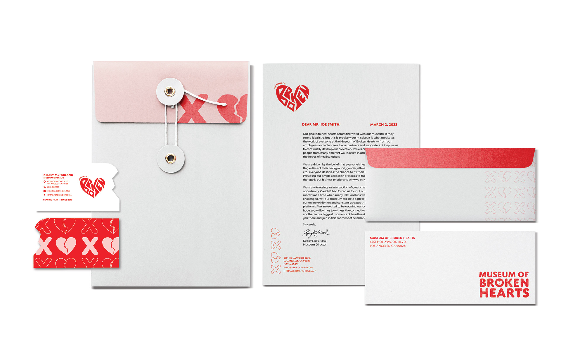
Students chose an existing museum from a provided list. Then, they thoroughly researched the institution and the subject matter to create a strategy for a museum rebrand. As part of the half-semester project, they created typography-centered logos and extended the brand identity to a full stationery suite for their museum. Students further developed the identity package by choosing three additional collateral pieces from a provided list, including brochures, out-of-home advertisements, social media strategy, web pages, merchandise, and more.
Corporate Publications
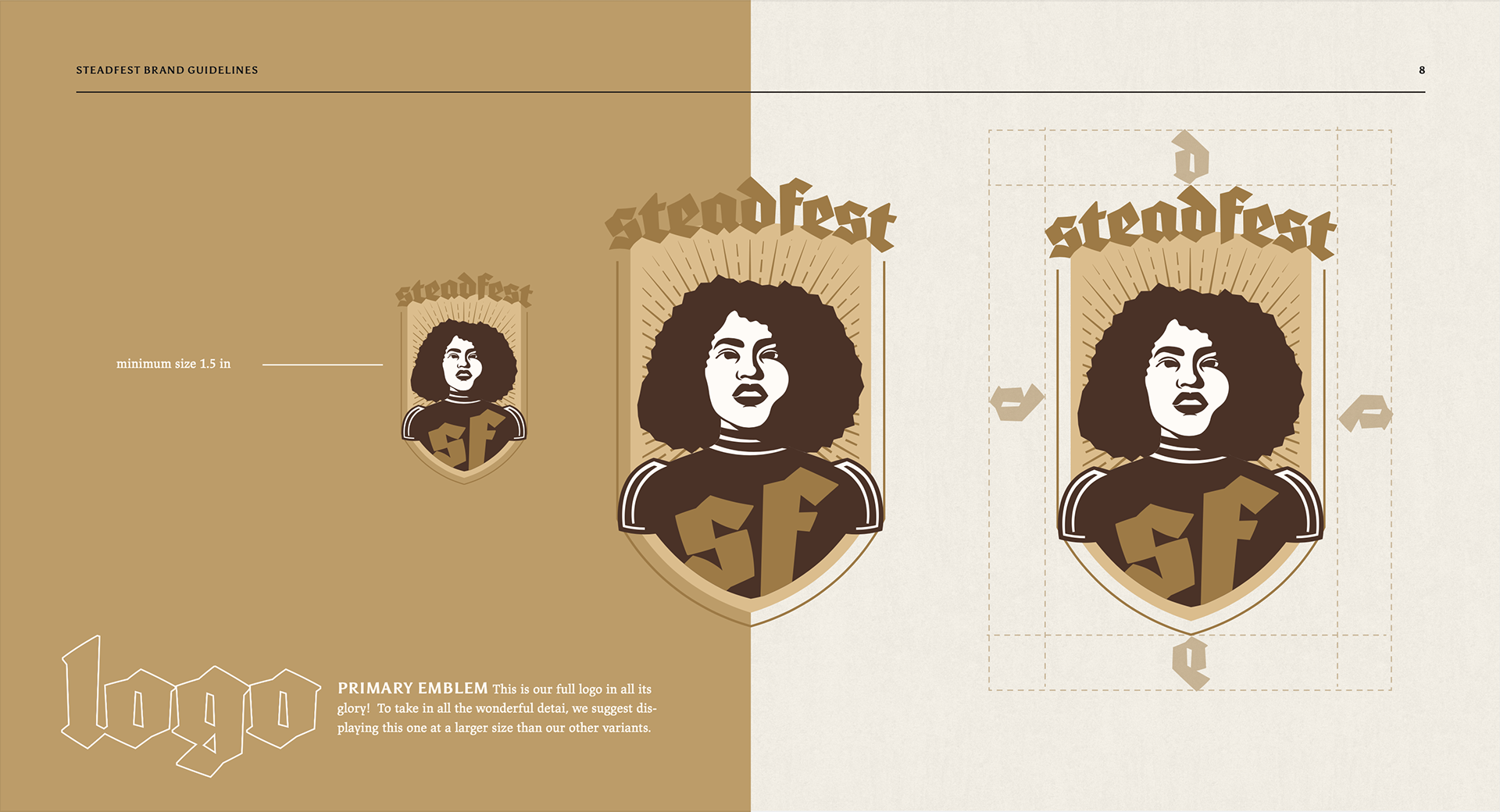
Brand guideline book
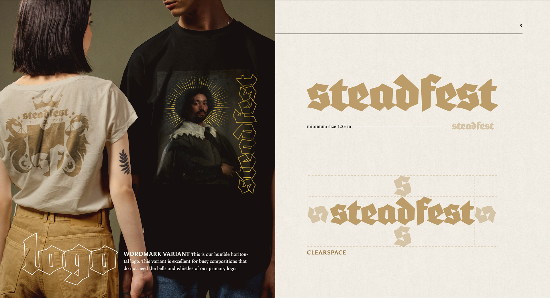
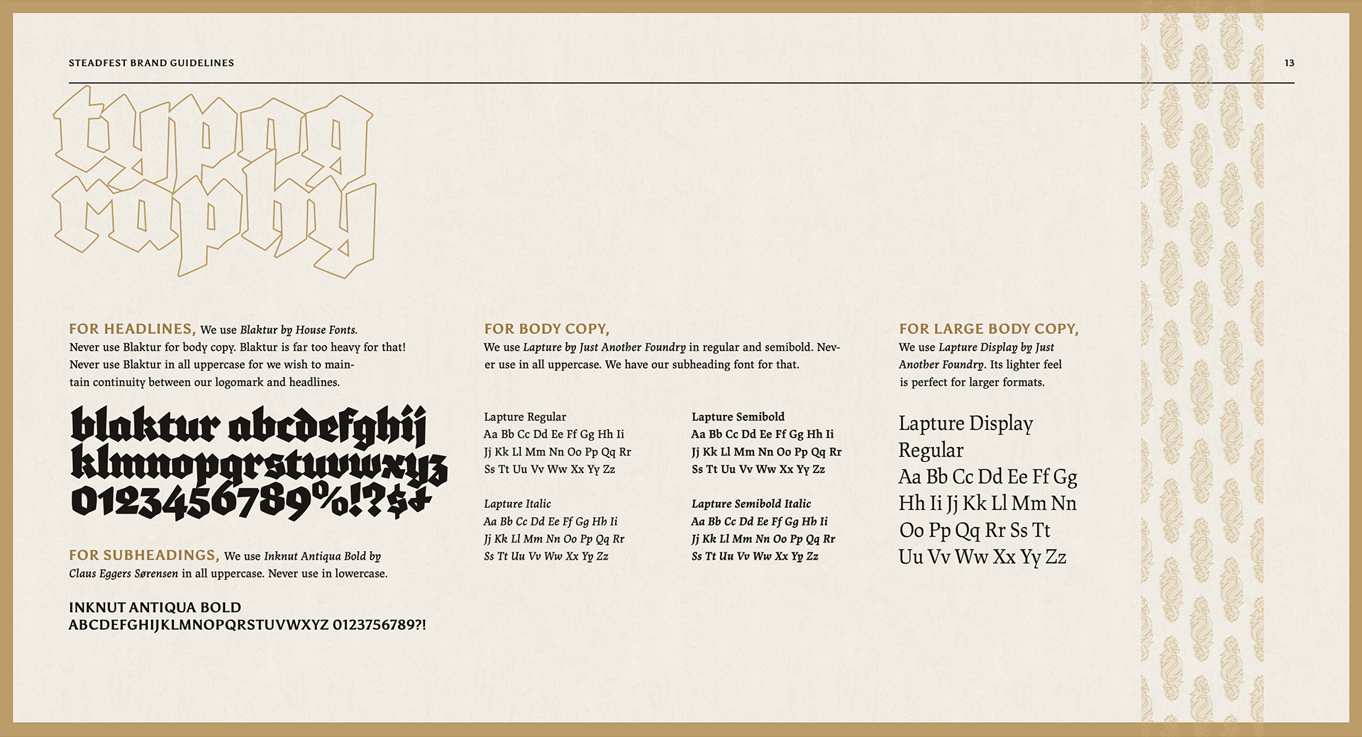
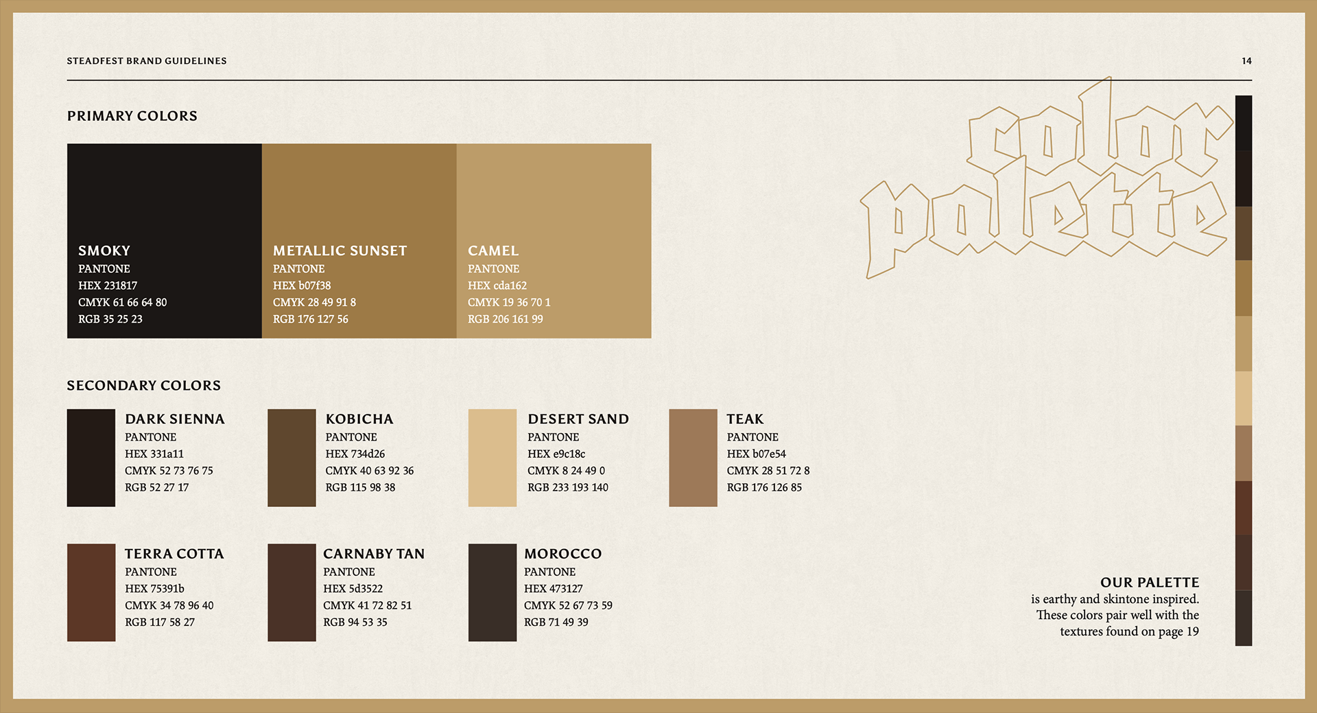
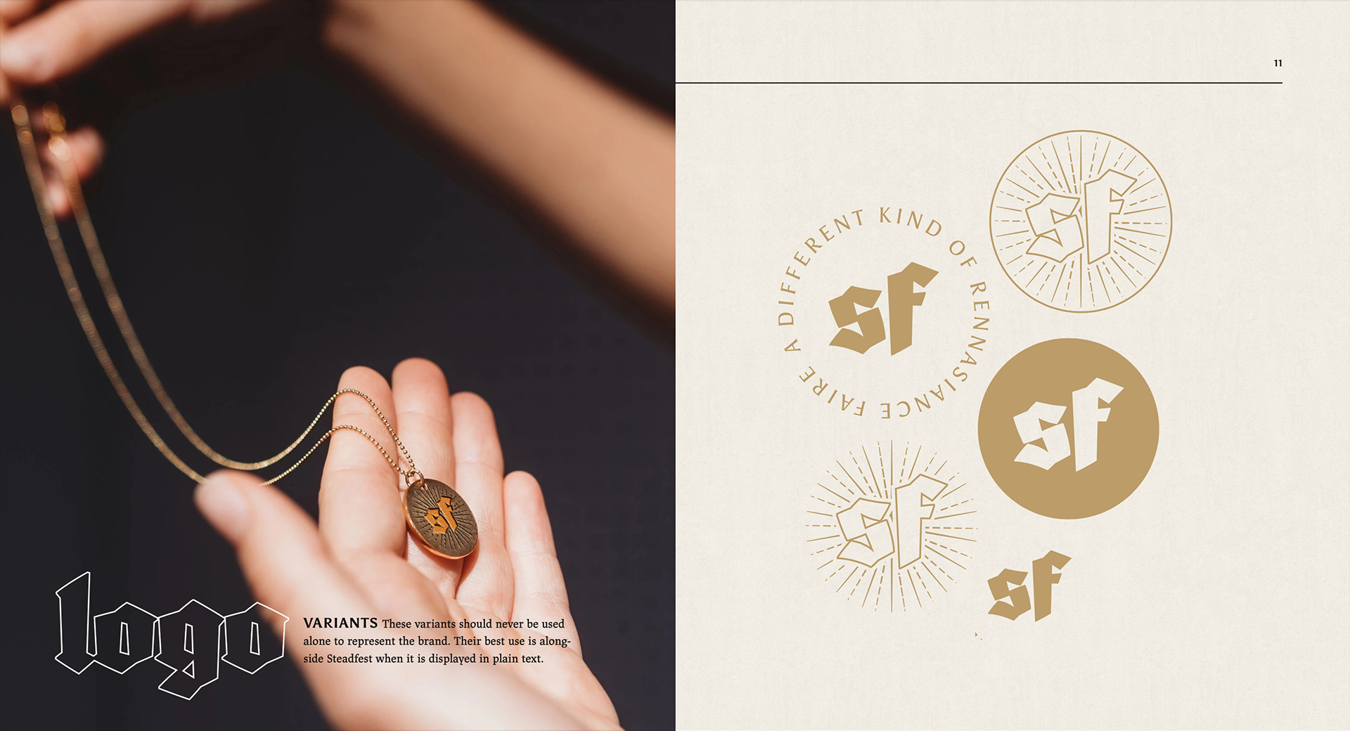
While working with Karen Kresge as a supplementary instructor, students created a brand identity for a weekend festival of their own design.
Students brainstormed full festival details through guided worksheets—eventually naming, planning, positioning, and designing a fully realized brand. Along with naming and creating an identity system for their festival, students developed a cohesive and thorough brand guidelines book, which included mock-ups of the event and merchandise they created.
Students brainstormed full festival details through guided worksheets—eventually naming, planning, positioning, and designing a fully realized brand. Along with naming and creating an identity system for their festival, students developed a cohesive and thorough brand guidelines book, which included mock-ups of the event and merchandise they created.
Typography II
Expressive typography
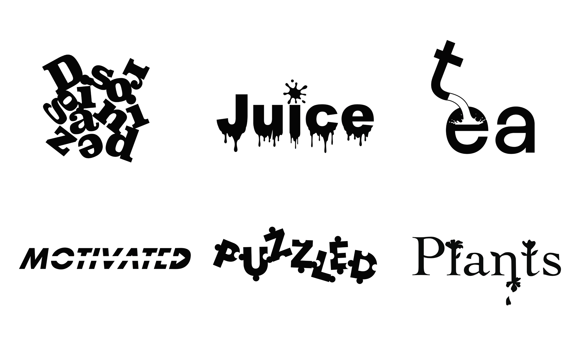
This project introduces students to how type can be manipulated to express meaning. As the first project in Typography II, it also serves as a way for students to get to know each other. Students introduce themselves by filling in three open-ended questions— I am, I like, I feel. They then explore ways to break down the word and letterforms to gain a deeper visual meaning without stretching or disproportionally scaling the type.
Typography II
Experimental typography
During the semester, I demonstrated techniques for using physical objects, tools, and processes to add character to any design project. I encourage students to step back from purely digital manipulation. Here, the headlines, call-outs, and images in this Rolling Stone assignment were created by physically manipulating a digital tool — the scanner. The student typeset headlines printed them out, then moved them around on the bed of an active scanner. As a result, they created a series of bold and exciting images and headlines to choose from as part of their magazine assignment.
Typography II
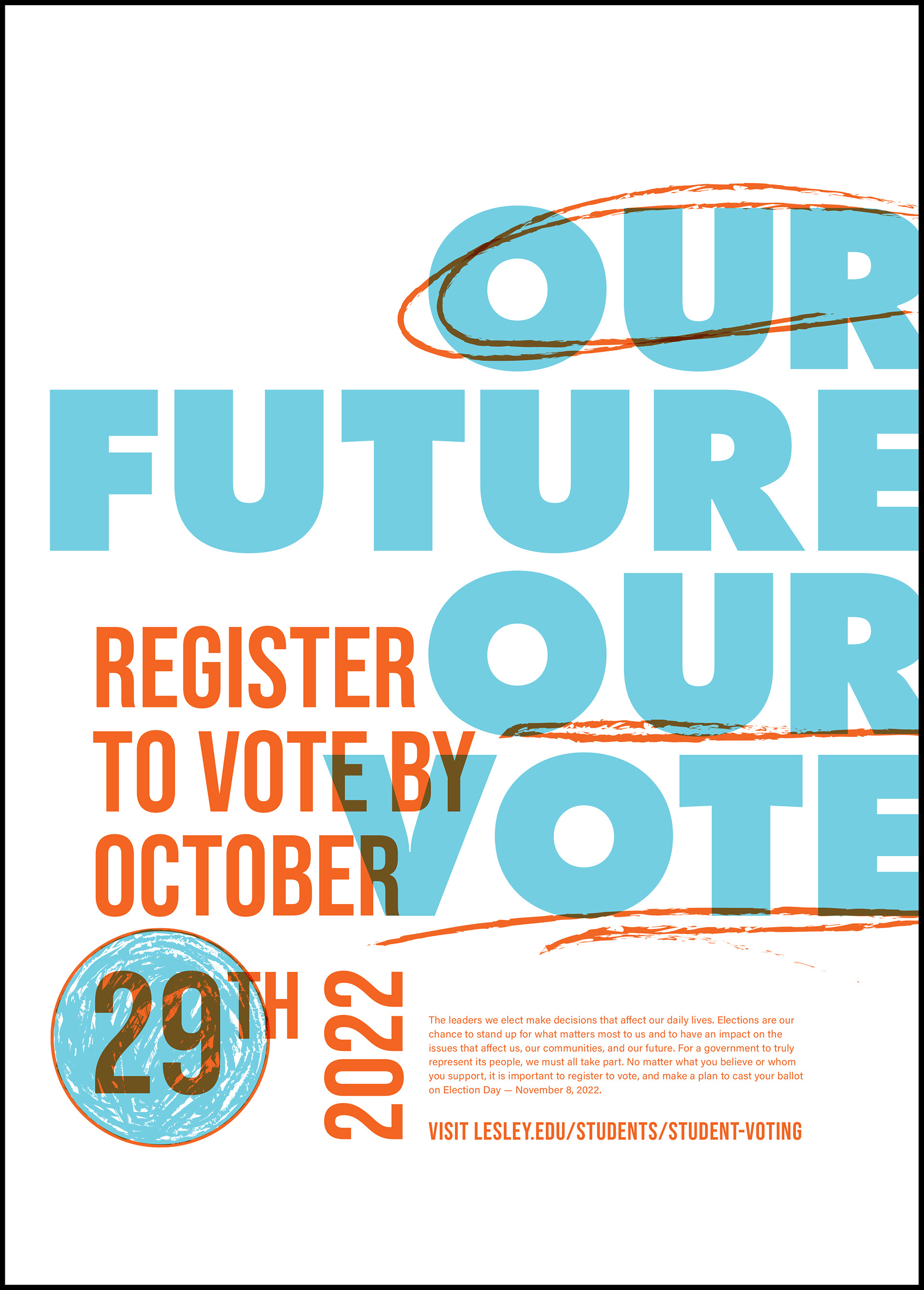
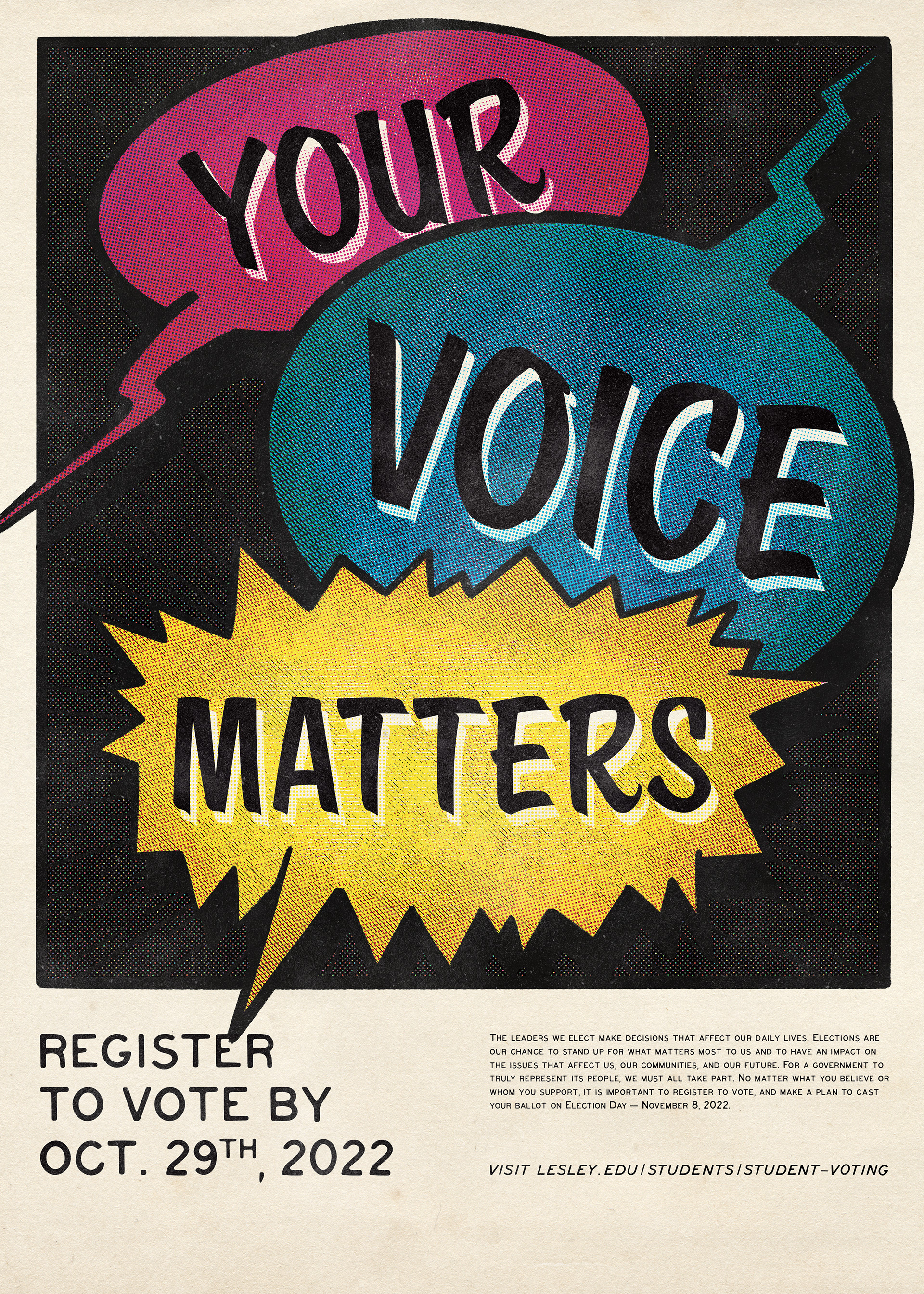
Social Ethos Poster
Students created an eye-catching poster using a nonpartisan design approach to encourage fellow students to register to vote. The assignment parameters asked students to focus on type rather than image, and students were limited to two type families. In addition, students use typographic hierarchy to display a headline, subhead, and body copy. Students printed four copies of their posters at the end of the assignment and hung them around campus.
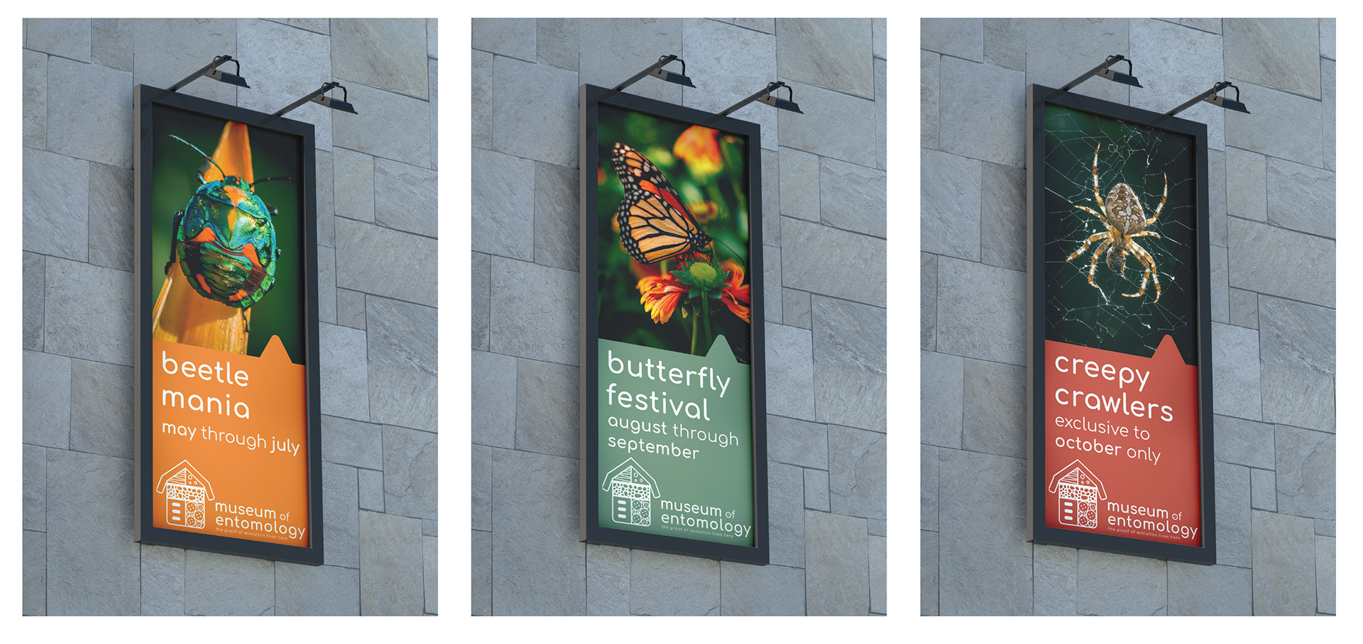
Typography III
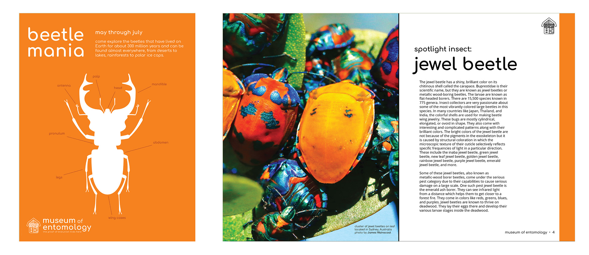
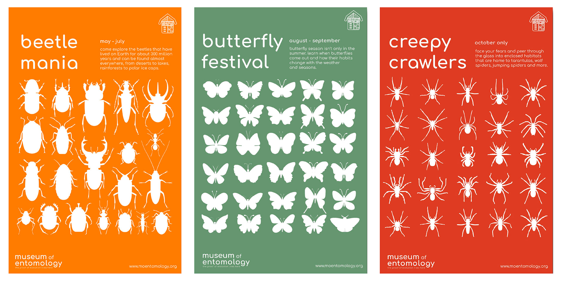
Museum Collateral
Students rebranded an existing museum that they believed needed a refresh. Then, they thoroughly researched the institution and the subject matter to create a new identity system. After completing a logo and brand guidelines, students chose three additional collateral pieces from a list of twenty. The brochure, exhibit posters, and billboard advertisements below incorporated a student's newly designed logo, color palette, and original vector illustrations.
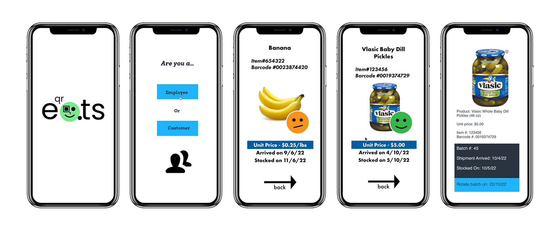
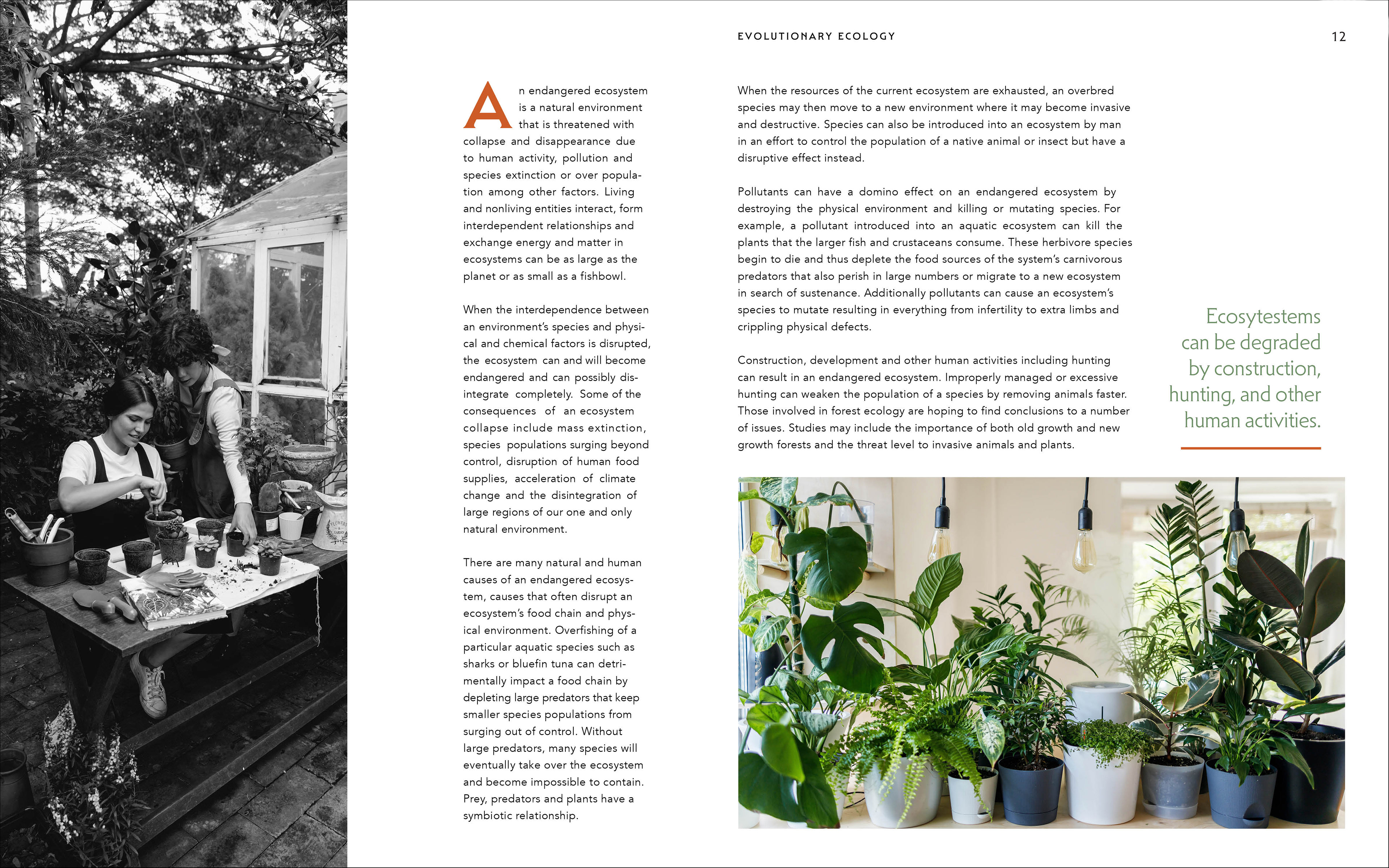
Design Thinking & Research
How might we reduce food waste?
Open to all students, this course pairs design majors and other students in teams to research a problem, identify the stakeholders involved, and brainstorm ways the problem could be solved. Students are given a prompt, in this case, reducing food waste in America, and begin their project by doing desk research into the subject matter. They then follow a design thinking process to narrow down the topic, determine stakeholders, do observational research, hold interviews, create profiles and avatars of users, and use all the data they have collected to brainstorm solutions for their stated problem. Finally, students evaluate their ideas based on a self-made decision matrix and ultimately choose the best idea to prototype and test with potential users.
The solution below is a phone app that allows shoppers to scan barcodes on food items to easily determine their freshness and employees to quickly see when to rotate products or remove them from shelves. The team created this prototype in Marvel, an app allowing anyone to quickly design and prototype an app concept.
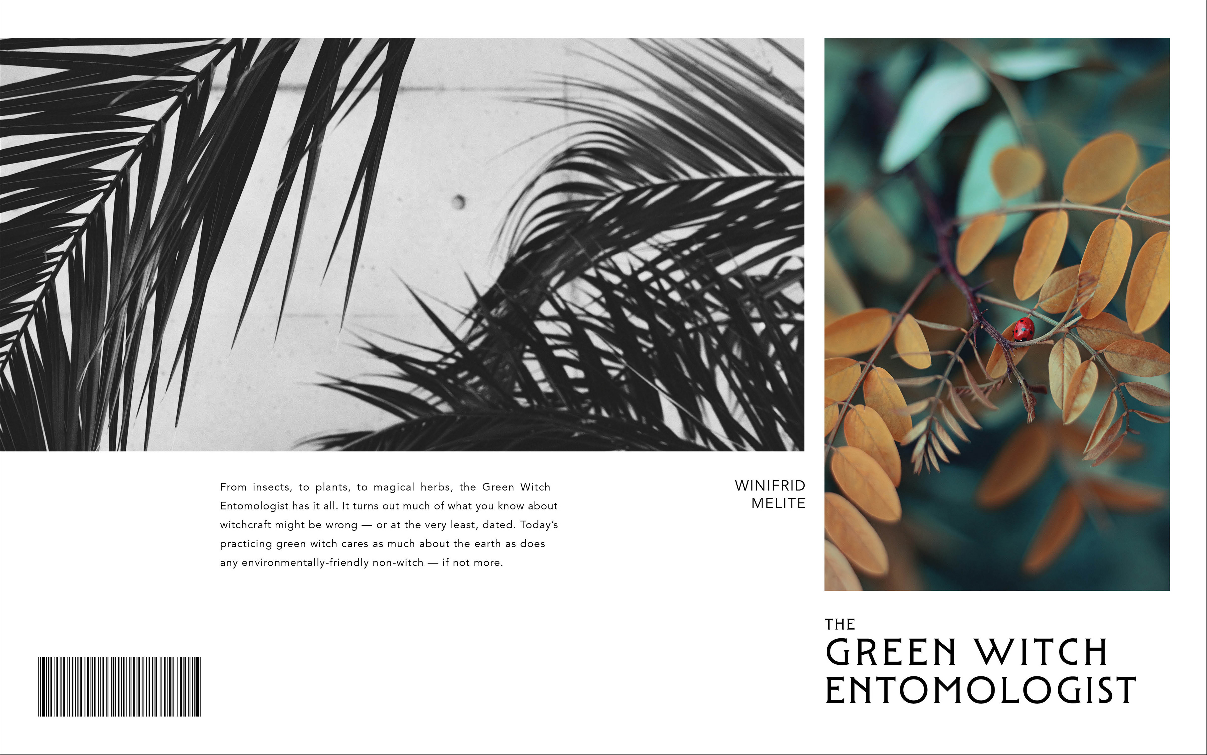
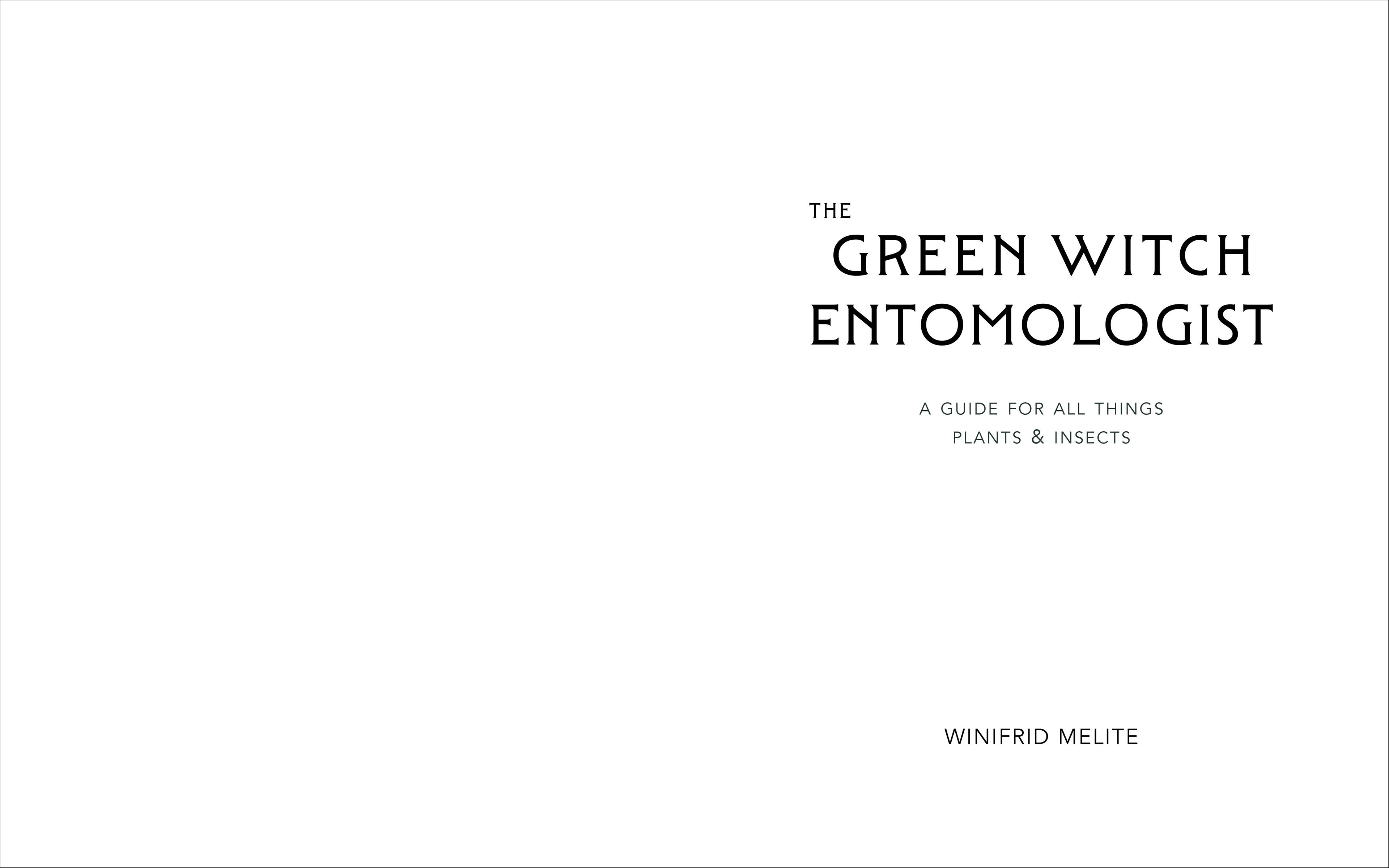
Typography III
Coffee table book design
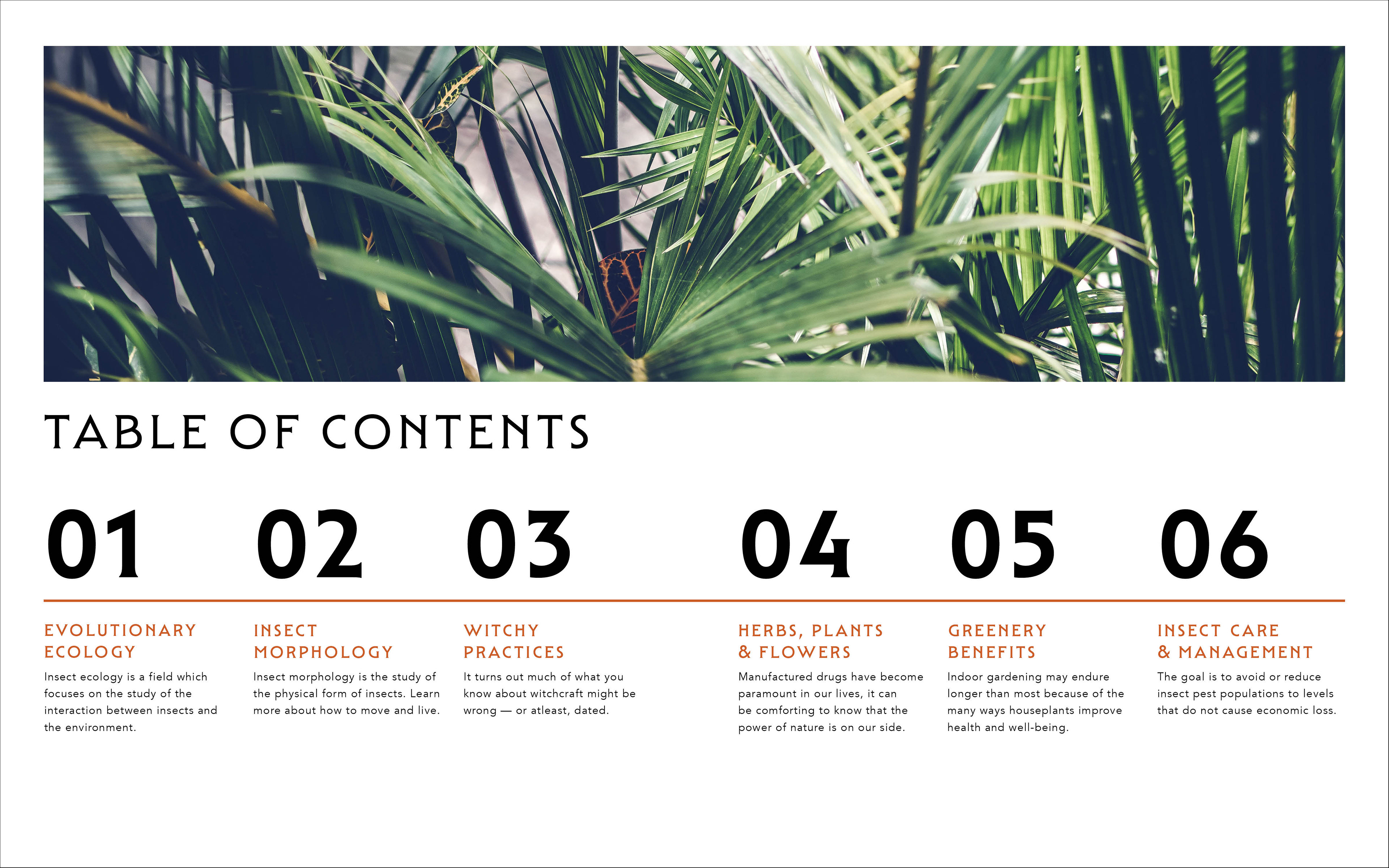
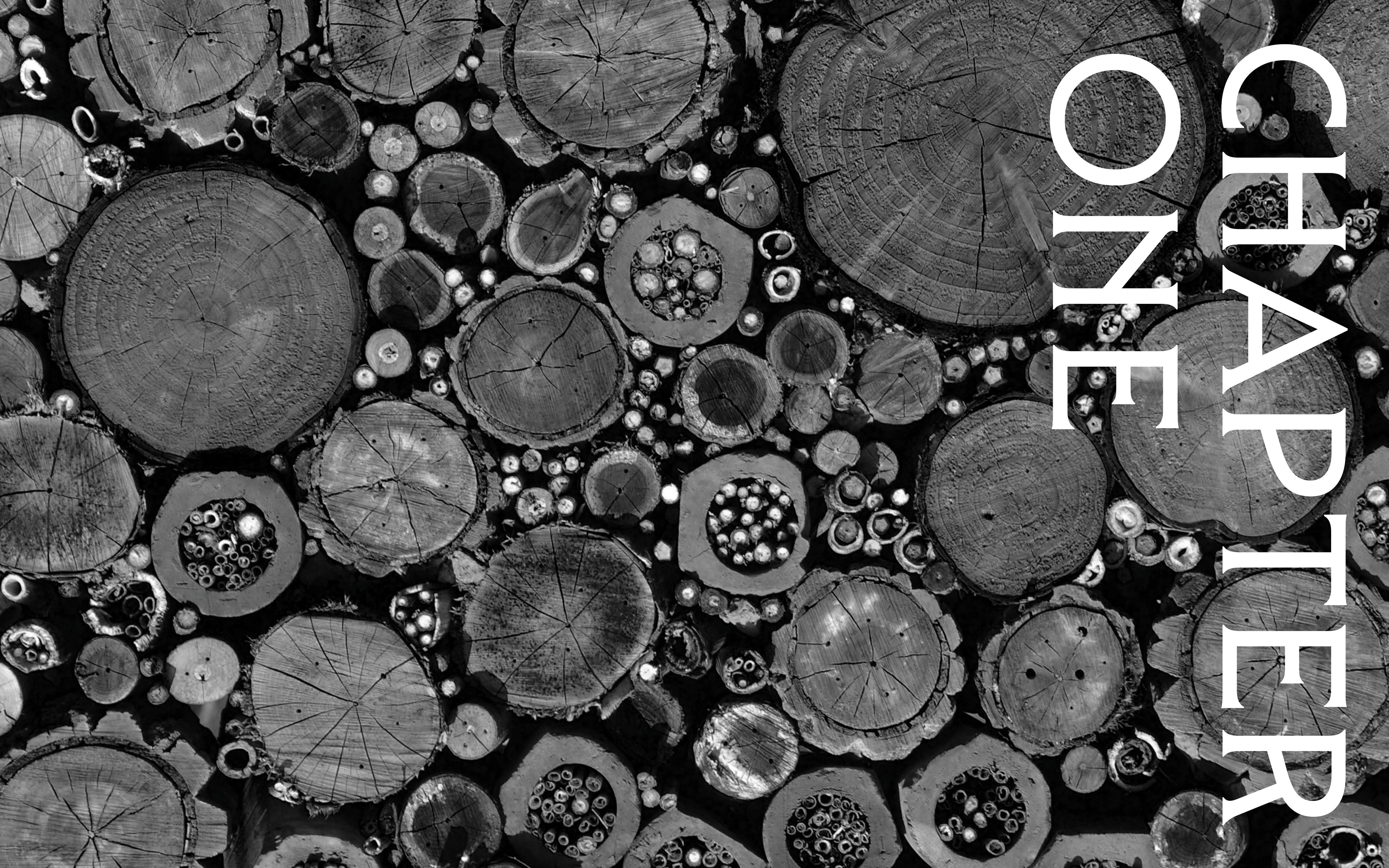
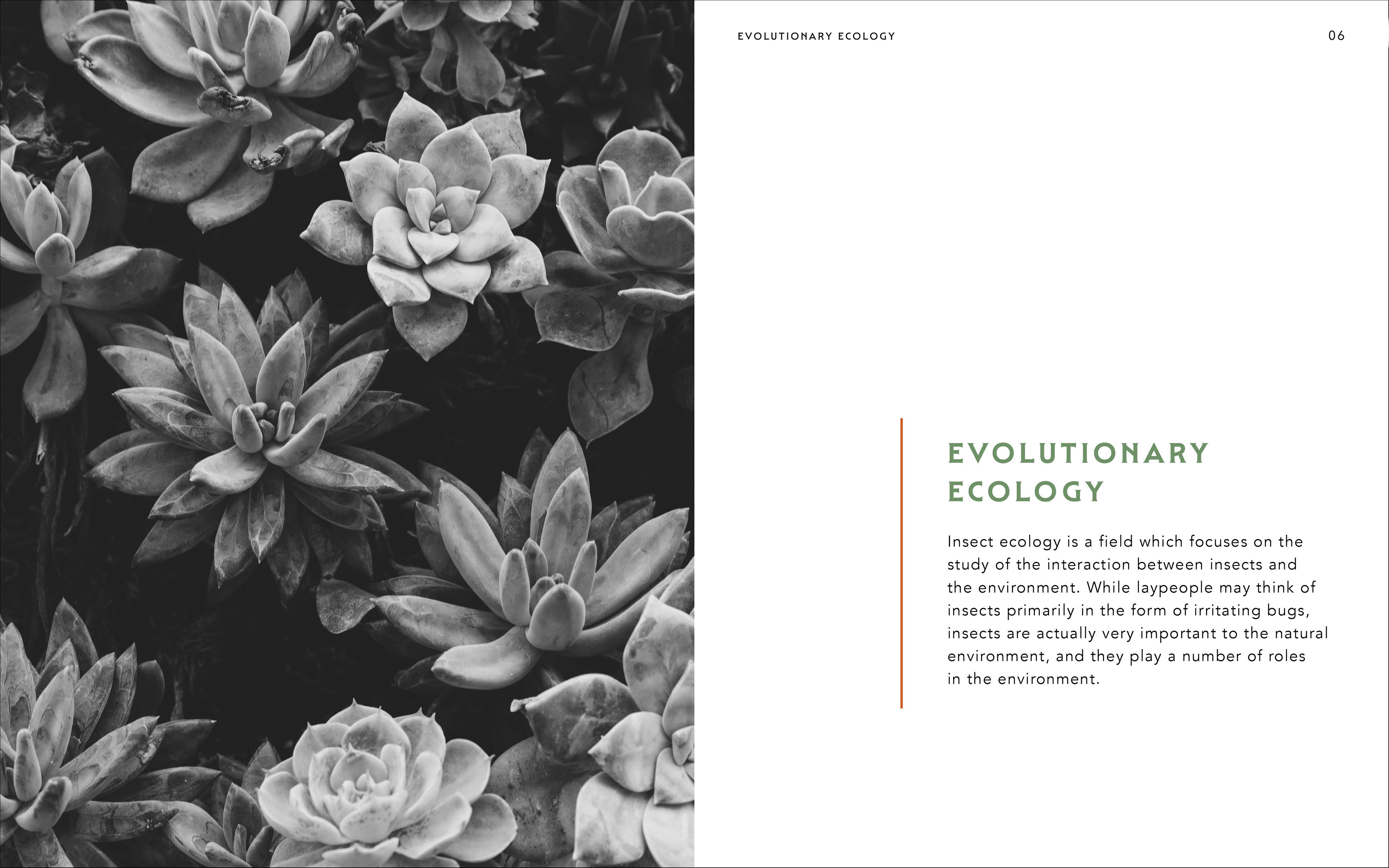
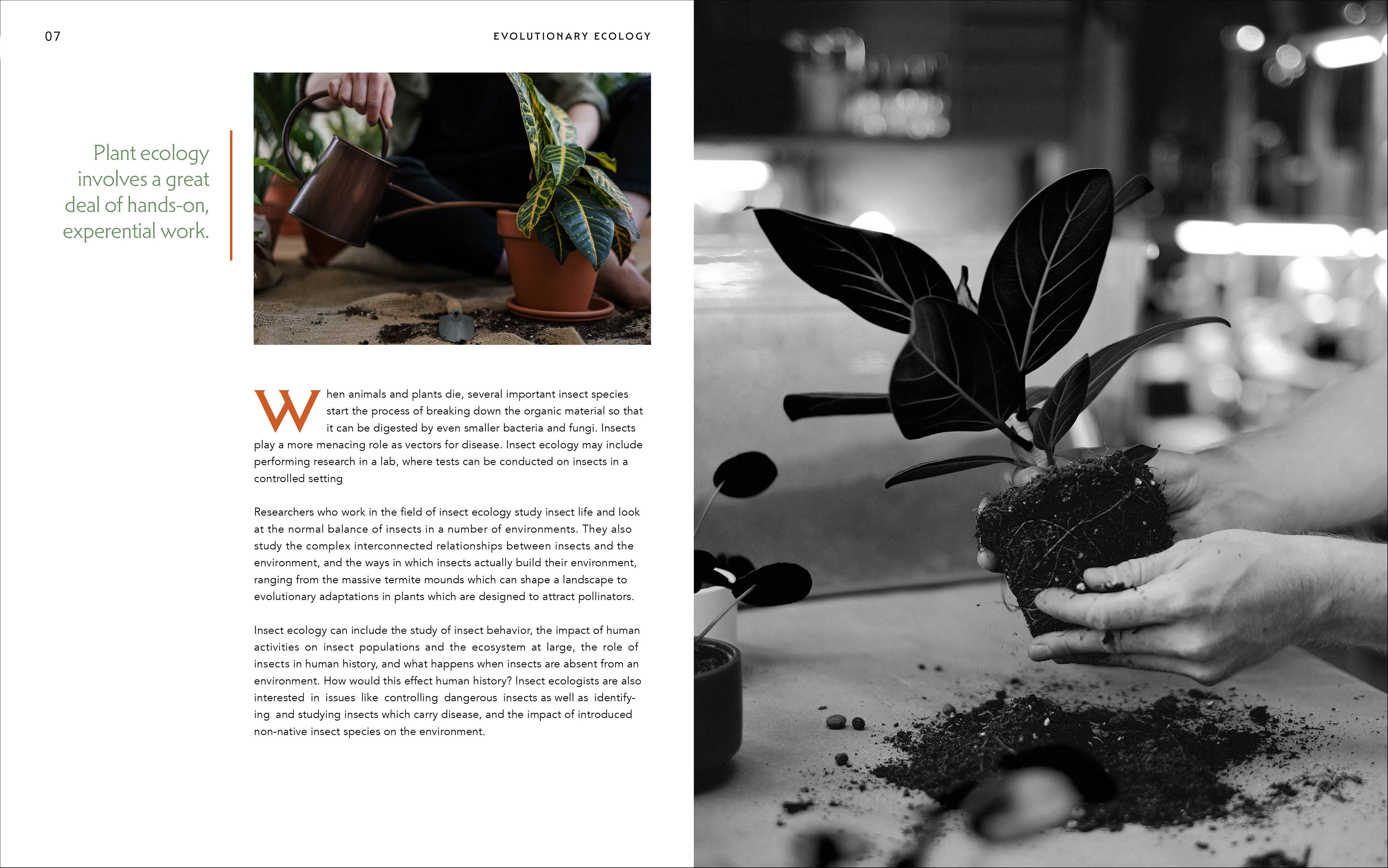
Students create a three-chapter coffee table book by researching a topic, sourcing photography, and writing chapter titles and call-outs. Students created a multi-column grid system to fit one of three predetermined book sizes. Using their grid system, they then design all the elements of a coffee table book using master pages, paragraph styles, character styles, and type-setting best practices. The final book comprises 19 spreads and features a cover, title, half-title, table of contents, three chapter dividers, chapter openers, and nine unique type and image spreads.
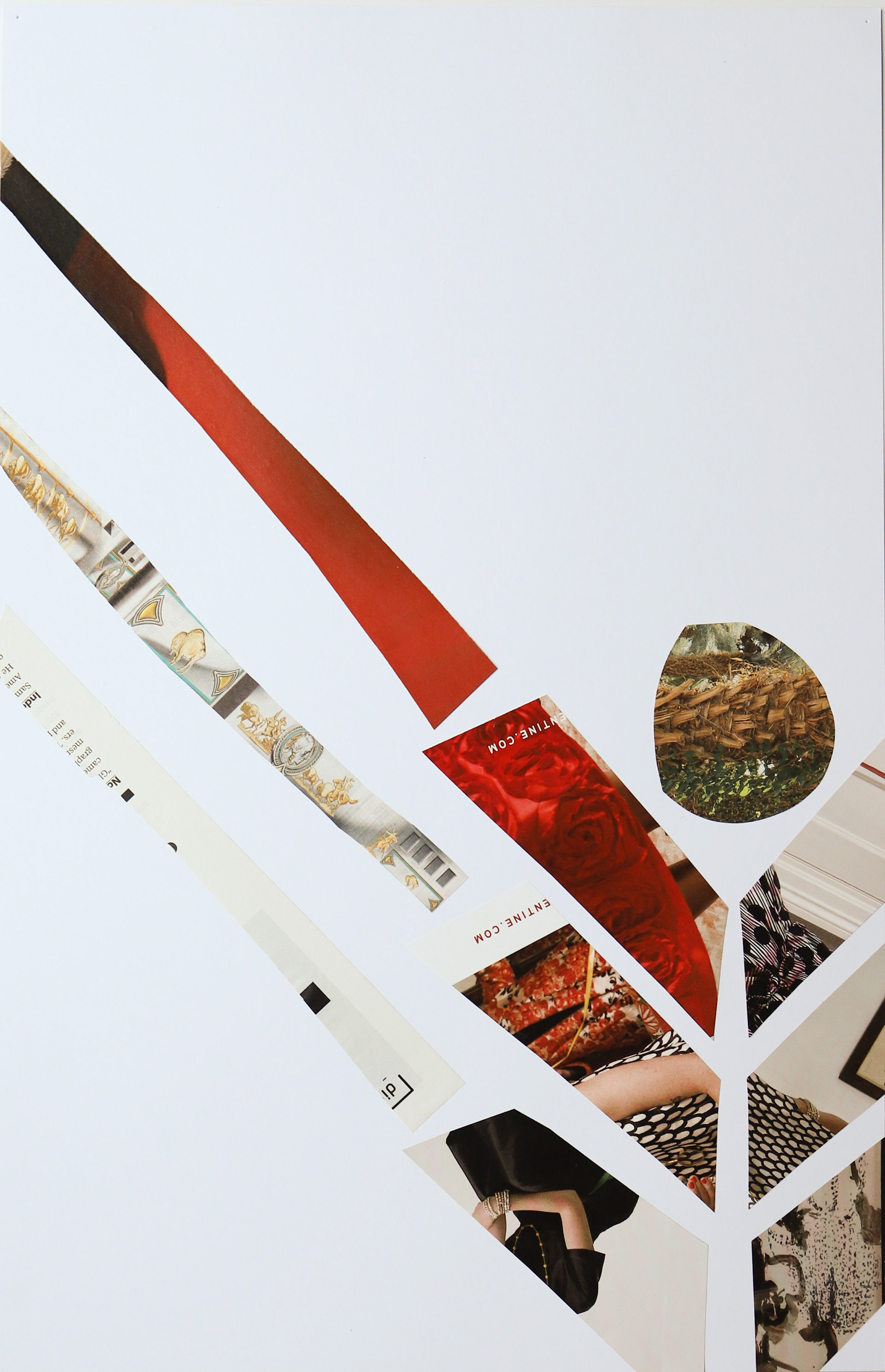
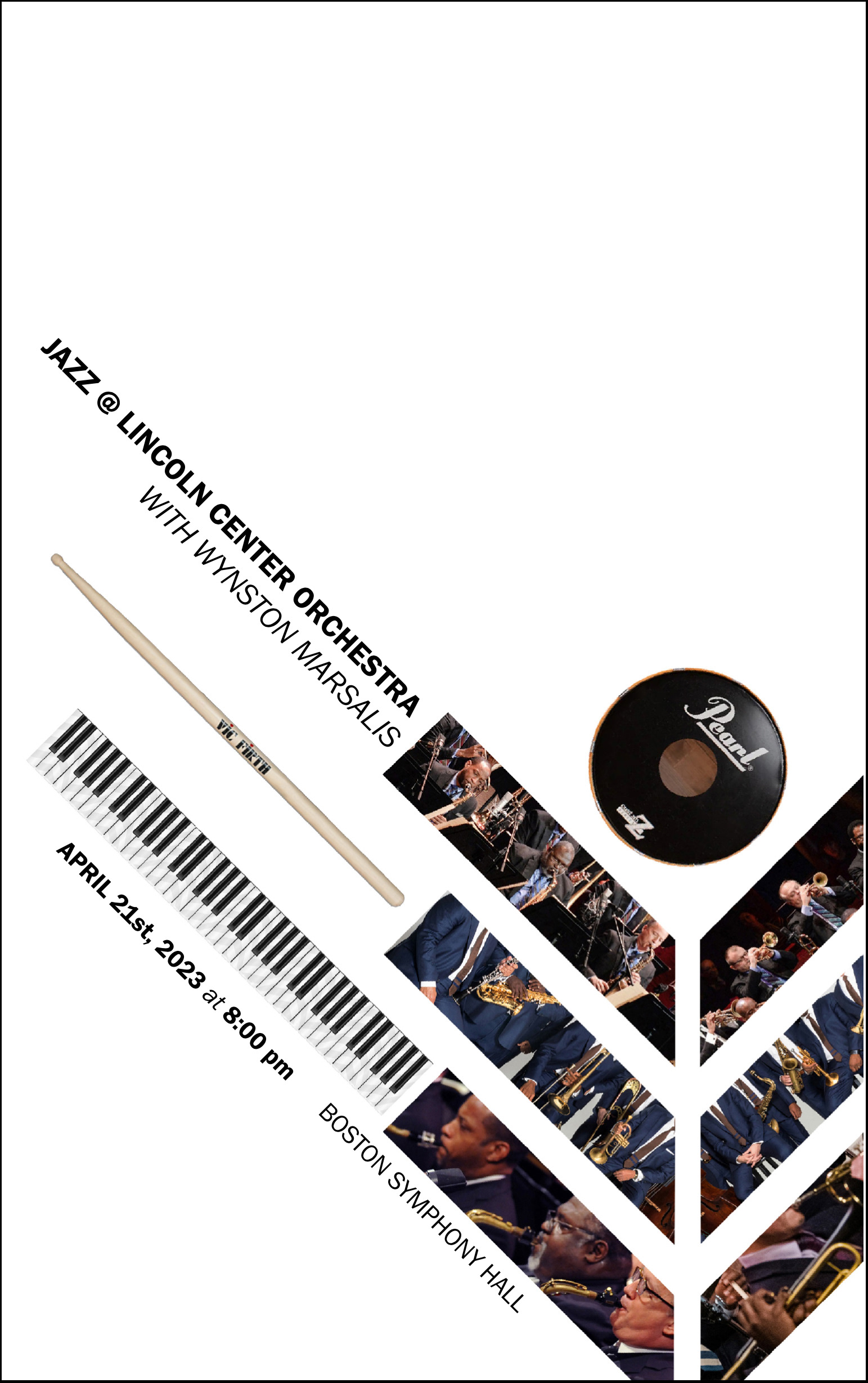
Visual Communications I
Chance form study
Part hands-on making, part digital collage, this project asks students to use what they know about balance, scale, and white space to embrace the magic of chance. To promote conversation and student boding, students cut and rip pages from magazines and place all the images together in a communal pile. Students then are instructed to create a collaged composition without further direction—to embrace the joy of making by hand. Students critique each other's work and then create an additional collage. Then, the true assignment unveils itself—choose your best composition and use it as the inspiration for a jazz concert poster. Students learn that good ideas don't need to be overworked.
Typography II
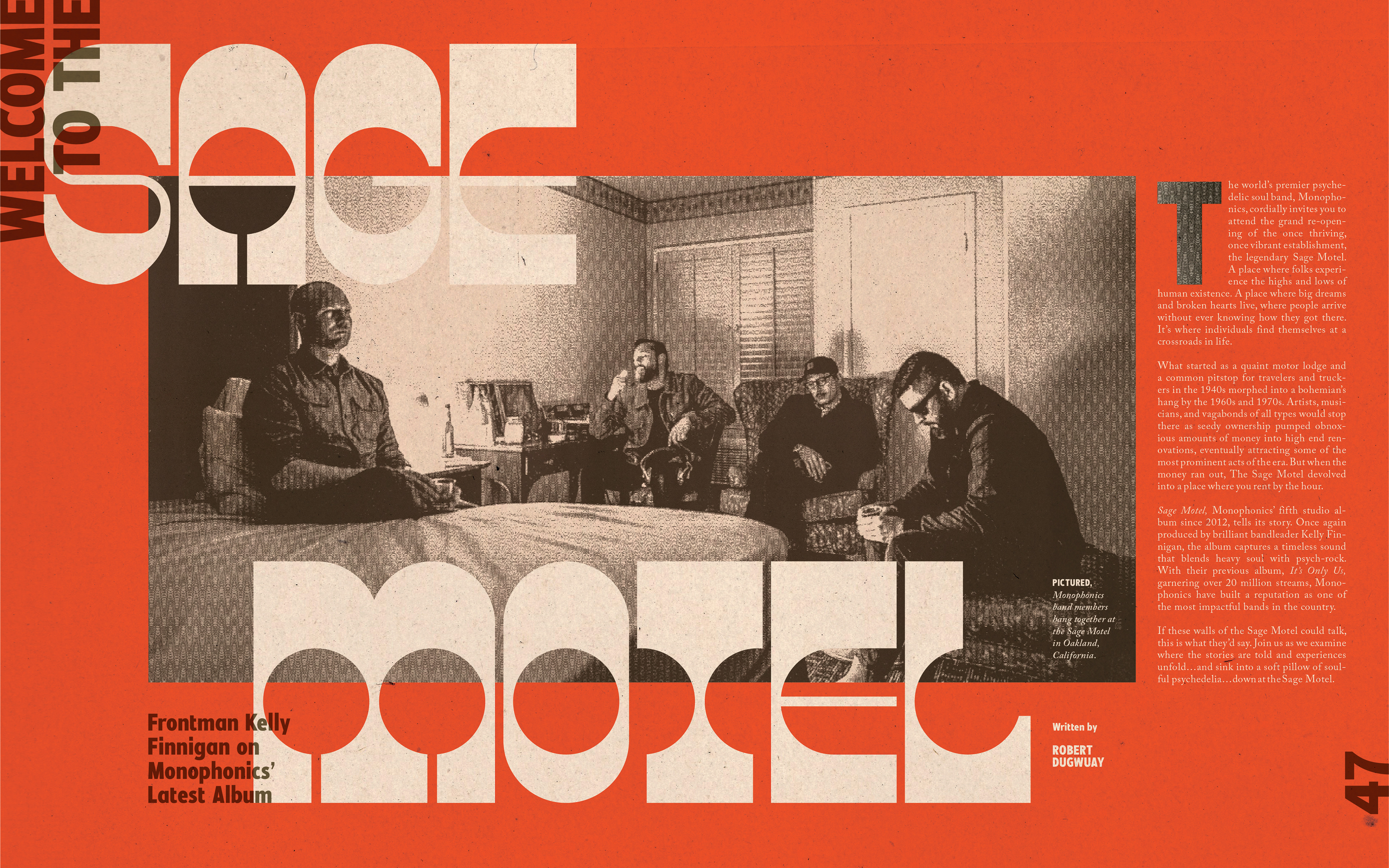
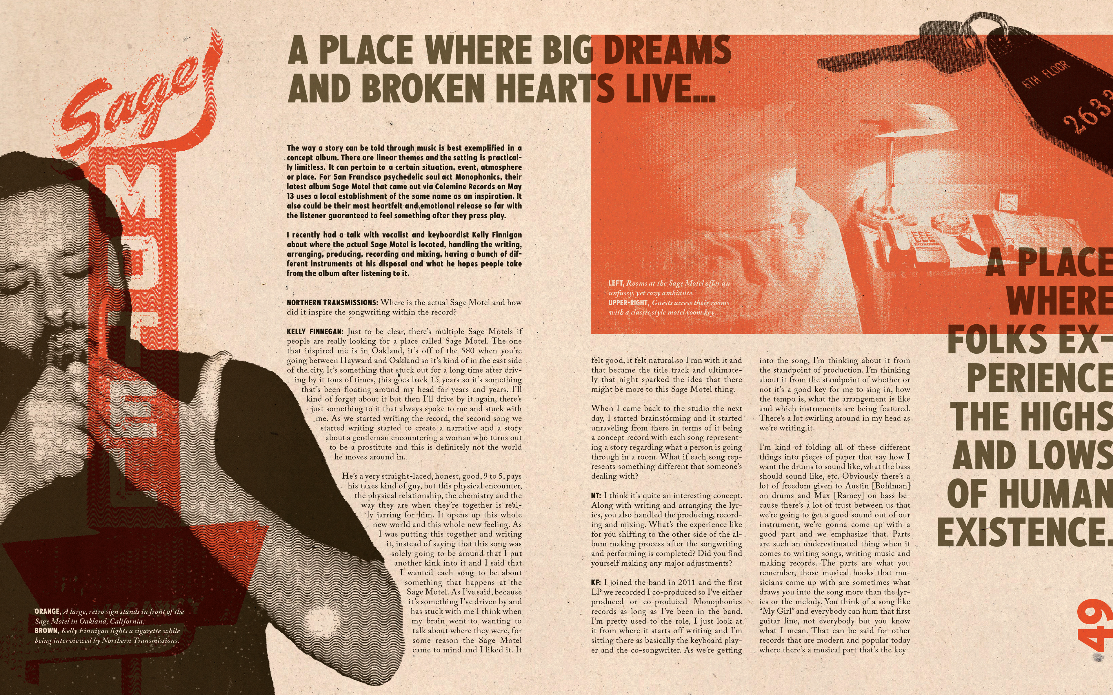
RollingStone article
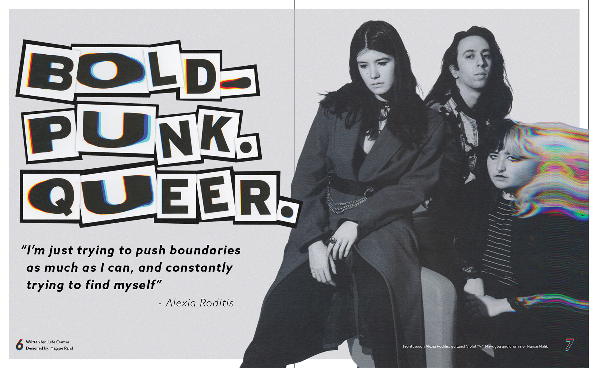
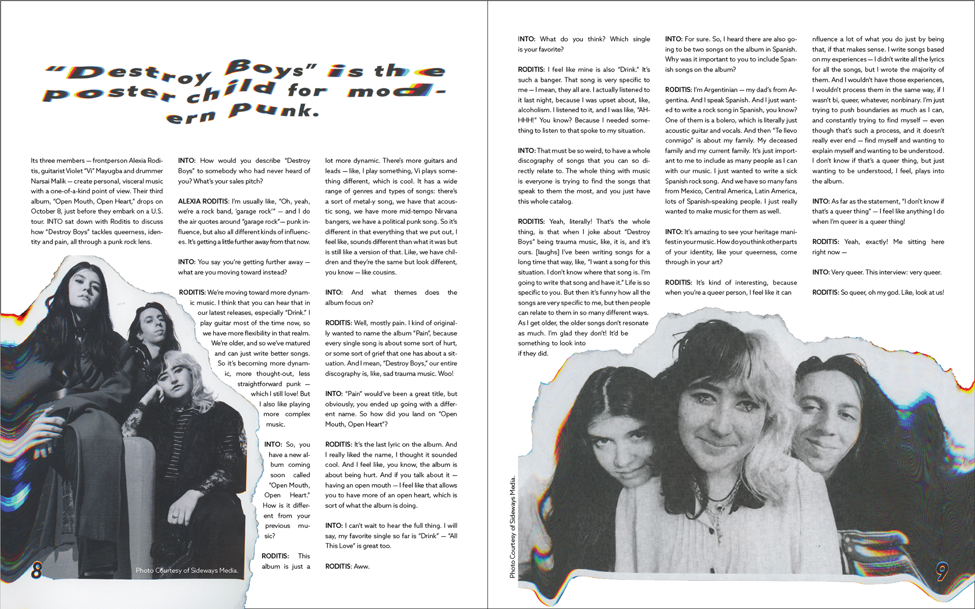
As a culmination of the semester, students create a two spread magazine layout featuring their favorite band or artist. Students explore the use of type and imagery together in a way that visually matches the music of their chosen musician. Students are asked to use all of the fundamentals and components they learned through the semester including, a multi-column grid, paragraph and character styles, master pages, file set-up and best typesetting practices.